Dynamic Illustrations by Ture Ekroos
Posted: October 23, 2012 Filed under: Inspiration | Tags: art, artwork, book cover, drawing, illustration, landscape, surreal, Surrealism, Ture Ekroos 13 CommentsBeyond his amazing technical painting ability, Ture Ekroos has a knack for creating well composed illustrations which establish a large scene. As a freelance illustrator living in Finland who commonly works on book covers, I can definitely see how that medium has influenced his work. Every piece is perfect for setting a story, involving dynamically positioned characters, and placing them in an interesting background with a clear climax coming to a head in the visual. Each work immediately draws the viewer in to the situation the characters are facing and are wonderful examples of great book cover design. Which I expect jump right off the shelf and into the hands of potential readers.
Check them out for yourself and let me know what you think…
Read the rest of this entry »
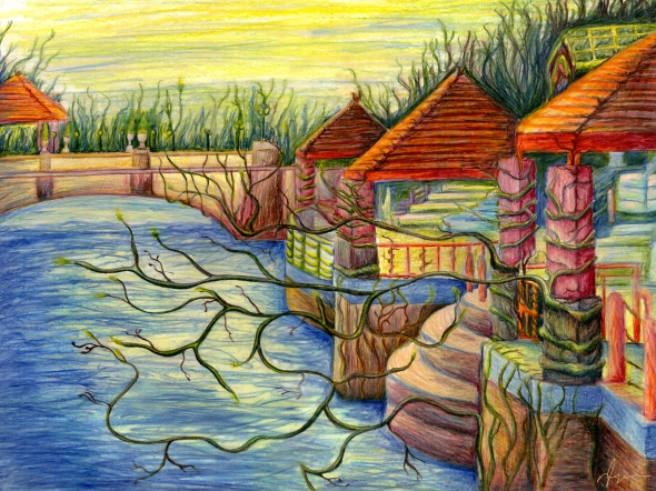
Back To The Roots – Colored Pencil Drawings From My Past
Posted: July 10, 2012 Filed under: Sketchbook | Tags: art, artwork, bridge, colored pencil, drawing, landscape, paper, sketch, Surrealism, traditional, vines, water 4 CommentsComing back to the roots of where I started in my art career, I decided to show some older pieces I created with traditional media. My professors described my art style in college as “painting with colored pencils”. I’d pull out my 250+ PrismaColor pencils set and disappear for hours, coming back with hand-cramps, the stubs of what used to be colored pencils, and a smile on my face. I would use extremely thin solid lines and a plethora of bright, saturated colors to create each artwork. Towards the end of each piece, I would go over the sketchy colored pencil with a white (or neutral colored pencil for the background) coloring over every line to blend the colors together. Each PrismaColor set came with a smudge stick for this very intention, but I hated the effect the smudge stick created. It was too wide and blurred all the lines instead of mixing the colors on the paper in specific areas. Using a thin tipped colored pencil allowed me to keep the crisp edges I wanted in some sections while blurring the colors in other sections. I found that when I moved to digital art with my Intous 4 Wacom tablet, the essence of my style remained.
Read the rest of this entry »
Inspirational Artist Feature – David Fuhrer
Posted: May 30, 2012 Filed under: Inspiration | Tags: art, Artist, David Fuhrer, detail, digital, earth, illustration, painting, space, Surrealism 2 CommentsDavid Fuhrer is an amazing illustrator and digital artist from Switzerland. The Surrealist theme to his work seems reminiscent of Salvador Dali, especially Fuhrer’s work entitled “Red Apple”.
“Drug Free Zone” has a beautiful, traveling composition. The way it leads you from one section of the painting to the next is magical. I love the illustrative style of the trees, but what really puts this piece over the edge is the depth of field added.
“Blue Moon” has to be one of the most complex paintings I’ve ever seen. I love the exaggerated size and style of the objects twisting, turning, and connecting on the surface of the planet. It seems alive with activity. The way the city scape extends into space reminds me of the imagery in “The Beast Below” episode of Doctor Who. In that episode, the entirety of the UK is placed on the surface of a large star ship. Click here for the full episode synapses.
With all of David Fuhrer’s artwork, I encourage you to really look close, the detail is absolutely astonishing.
Read the rest of this entry »


